Nitro Nation World Tour
Mythical Games worked with CM Games to bring true ownership of cars and other items to the world of Nitro Nation, bringing the hugely successful franchise (with over 75 million registered users) into a new era.
I worked on many aspects of the product, including wireframes for new features aimed at improving player engagement, hands-on UX/UI such as FTUE design, feedback on track design with our partner developers, and even taking part in AMAs with our highly engaged community.
My role: Lead UX/UI Designer
Creative Direction
UX Design
UI Design
Auto industry knowledge (/petrolhead)
Results
Successful launch in Google Play and the Apple App Store - one of the first games on both platforms to integrate player-owned assets.
Authentic racing experience with new gameplay mechanics, unique to the mobile racing space.

I’m proud to have been part of the team that created Nitro Nation World Tour.
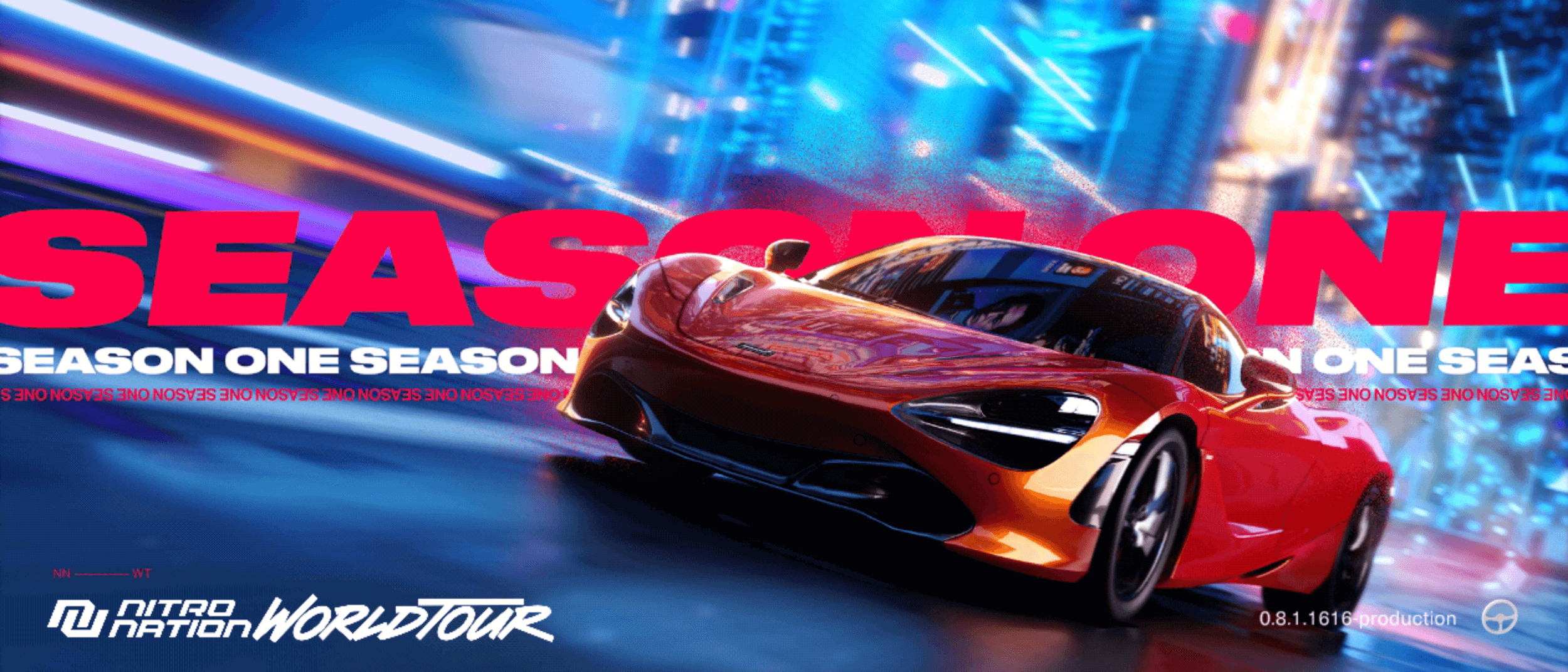
It was a wild ride, one that enabled me to get stuck into so many aspects of the creative process, from establishing the background story based on a travelling festival combining music and racing, to finding the right name for the game to continue the Nitro journey.
Creative Direction

Nitro Nation World Tour introduces new features to the mobile drag racing space, including collectible (and tradable) cars and workshops, racing clubs for players to team up with their friends, and much more.
Every new feature needed to be designed from a player-first perspective, so everything begins from UX best practices such as ease of use, consistent visual language, clear signposting, and accessibility.
We also assembled a brand guidelines website for 3rd parties to follow to stay on brand.
UX/UI Design

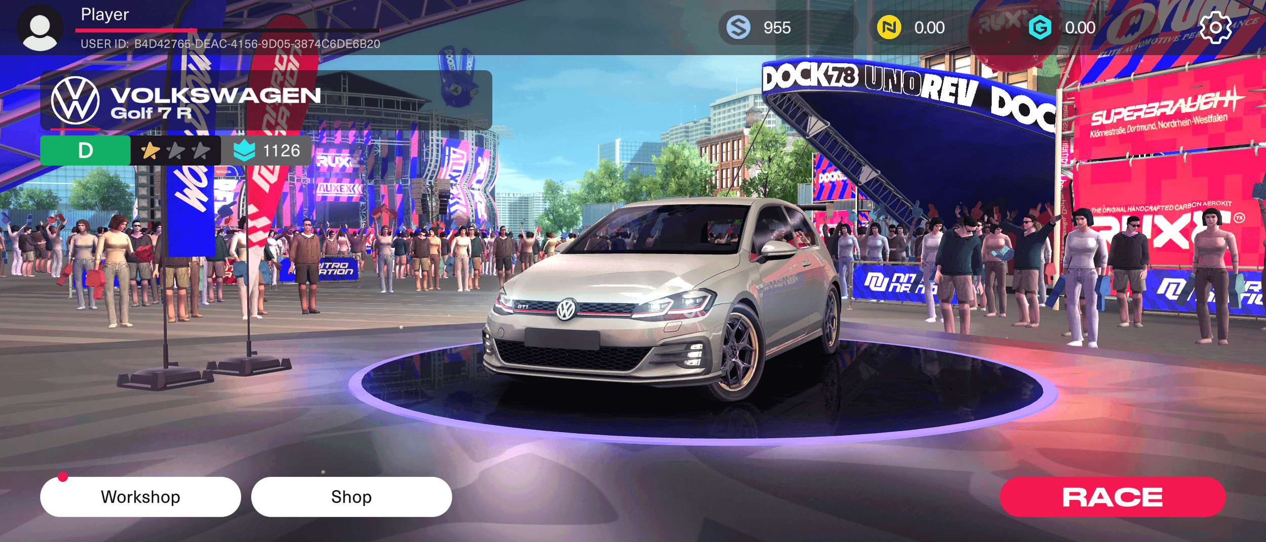
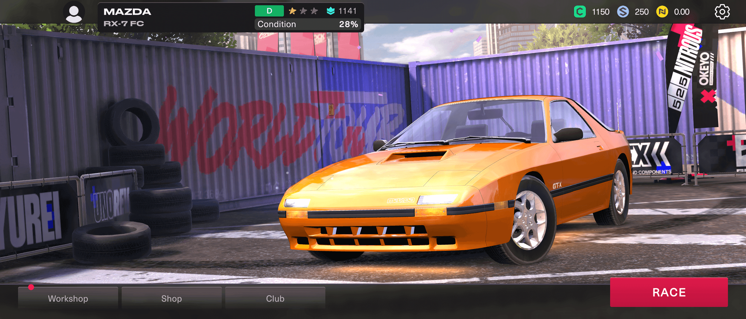
These screenshots from both Figma mock-ups and pre-production game builds show the process of developing the home screen for the game.
Our earliest proposals used the idea of a festival as their starting point for each session. With more licensed brands coming on board, the car really became the star so we made the home screen focus on the player’s current ride.
Early builds featured placeholder assets (check out the crowd!) but really started to increase the feel and flavour of the festival vibe. We experimented with a more restrained UI style for the Early Access build, but it didn’t hit the mark - it just wasn't enough fun.
One proposal experimented with a layout using stacked main buttons down the right side of the screen guiding the player’s view down towards the primary CTA: Race!
The bottom image shows the Season One launch version of the home screen. Definitely needs some work on the visibility of those buttons on the right.
Home Screen UX Story


Petrol is in my veins so this was a dream opportunity to combine that with my years of UX/UI experience and creative leadership.
I really enjoyed engaging with the NNWT community in our regular AMAs, and representing the game when we partnered with deadmau5.
I joined conversations with OEMs to demonstrate the value to them in becoming a partner in the game, and worked with the game design team to set the tiers for cars once we had a manufacturer on board. Which McLaren would you choose?
Auto Industry Knowledge.